Improving Download and Share Options
User feedback has a way of highlighting areas in need of attention, and in this instance, it directed us towards a fundamental aspect of the prototype - the download and share options. Users expressed their concerns, indicating that they were unclear about what the download options entailed and why they existed. A specific example was the confusion surrounding the “download code” option, as some believed it would provide them with a spreadsheet containing the data they had entered.
Clarity through Description
In response to these user concerns, the design team took action. The primary goal was to enhance the download screen, not just through relabeling but also by adding explanatory text to eliminate any ambiguity.
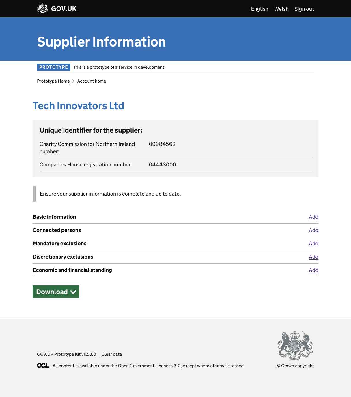
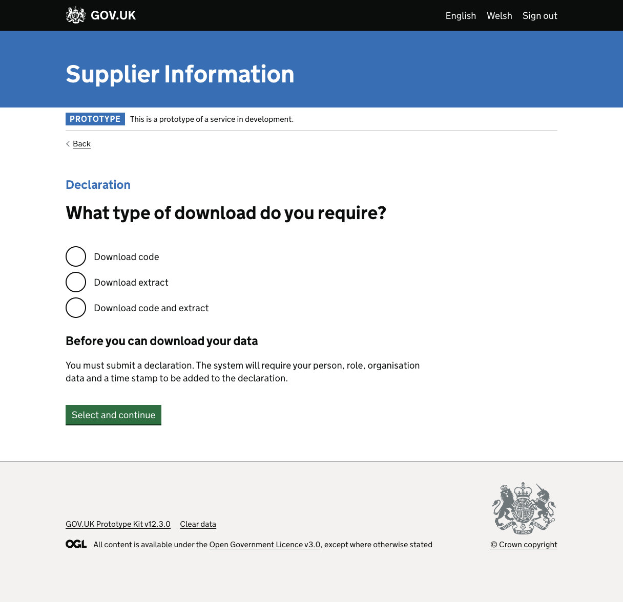
Before the Enhancement


The initial screen left users uncertain about what the download options actually meant.
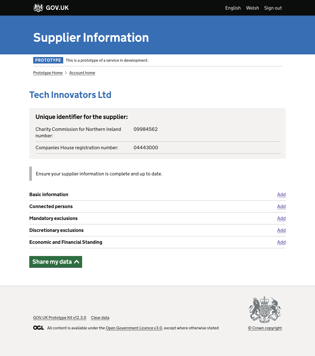
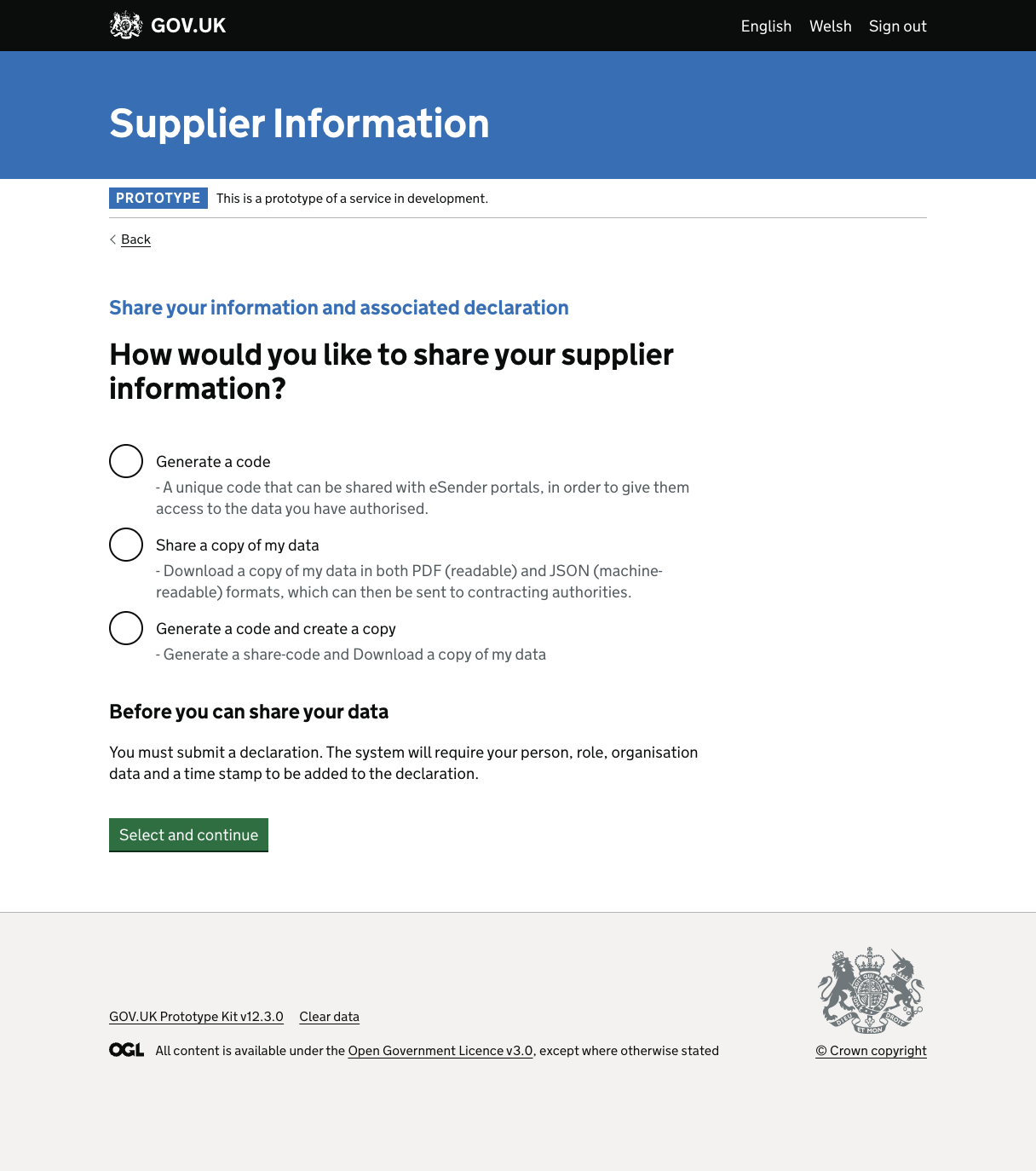
After the Enhancement


Post-enhancement, the screen had a noticeable transformation. It was relabeled and enriched with descriptive text, clearly outlining the options for users. These changes aimed to provide users with two clear choices:
- Obtaining a ‘unique numeric code’ for sharing with Buyers and E-senders, allowing them access to specific supplier information.
- Downloading an extract of data in specific formats, which could be shared with Buyers or E-senders when submitting bids.
A User-Centered Approach
“Share your data” underscores the importance of listening to user feedback and acting upon it. It’s a demonstration of the team’s dedication to enhancing the user experience and ensuring that users have a crystal-clear understanding of the download and share options at their disposal.