Re-designing the Home page
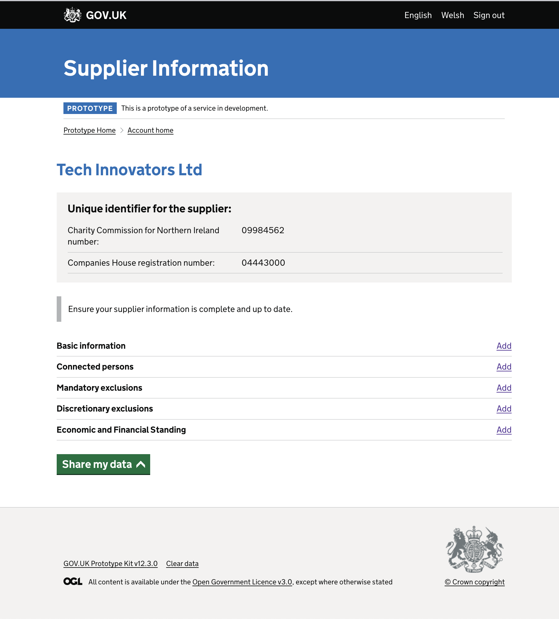
The original design of the Account Home page employed a summary list pattern with actions situated on the right-hand side of each row. However, user feedback raised concerns about its helpfulness and potential confusion. Additionally, returning users lacked visibility into when the last data had been recorded, creating a sense of uncertainty.
The problem space
A significant issue emerged when users, having submitted a section of data during the initial journey, returned to the Account Home page. The page failed to convey whether the section was in progress (e.g., incomplete) or completed, leaving users in the dark about their data submission status.
Before the Re-Design

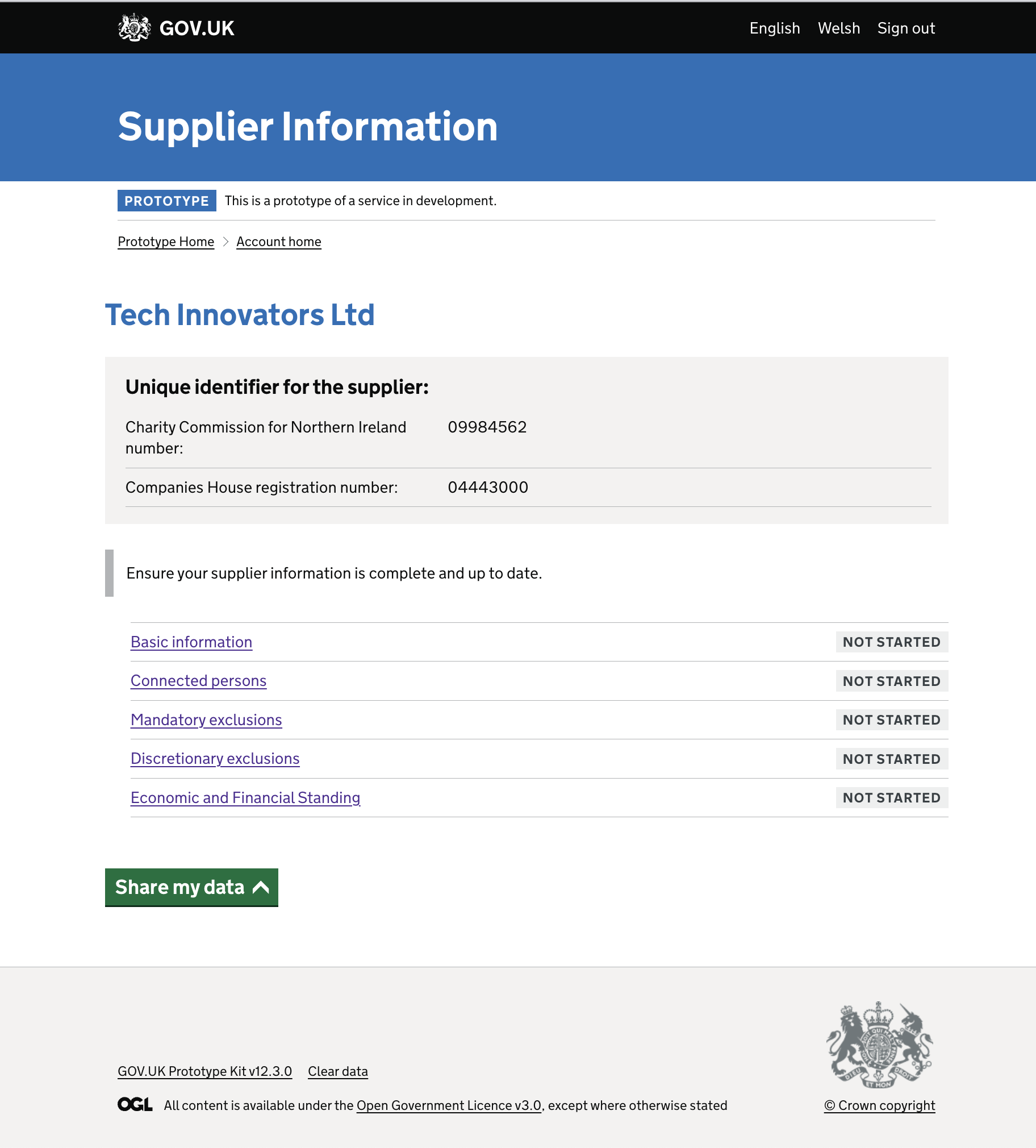
Working with tags
To address these concerns, the team decided to leverage Tags, integrating them into the Account Home page. Tags provided both visual and audio feedback, offering users a clear understanding of their progress.

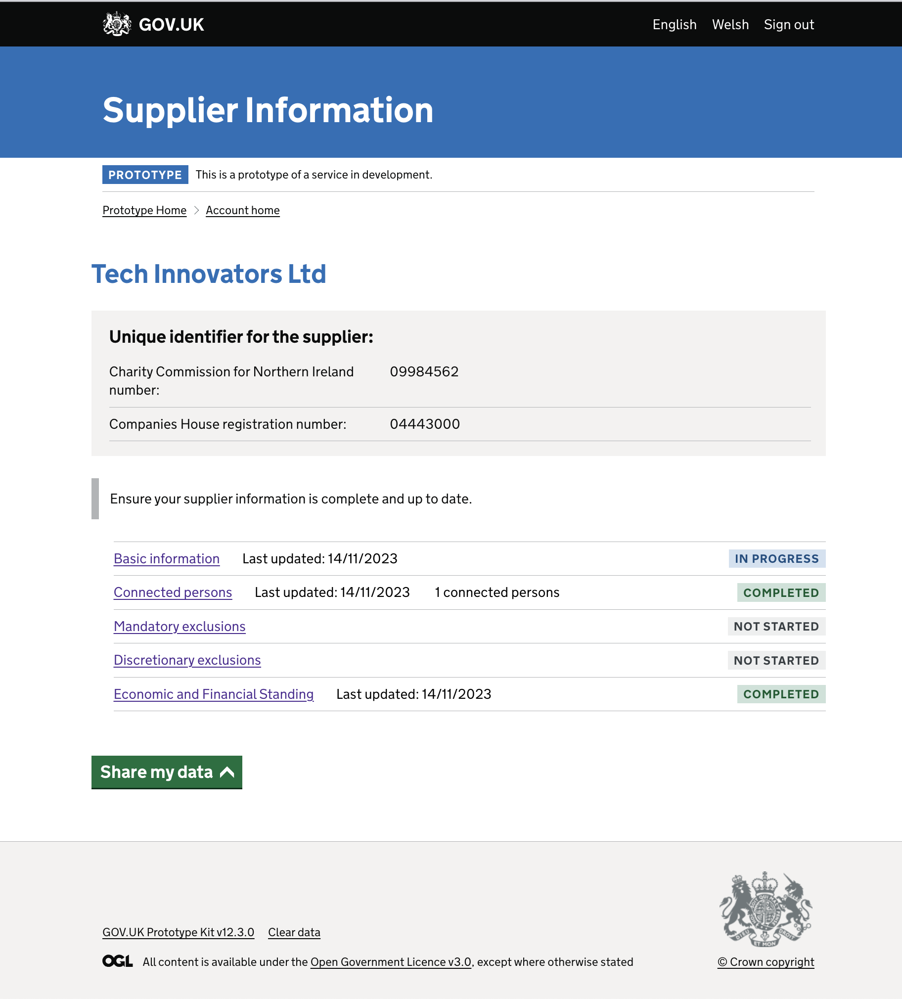
Increasing clarity
To further enhance the user experience, the next step involved incorporating timestamps within each row of the sections. This addition aimed to provide users with information on when each section was last updated. Additionally, relevant data was reintroduced to give users the essential information required for quick assessments and to determine whether any amendments were necessary.
After the Enhancement

Next steps
As part of the third round of research, the team anticipates observing an enhanced user experience with increased clarity and understanding. The iterative approach to design improvements ensures that user feedback is continually integrated, refining the Home page to meet user needs effectively.