The Role of Hint Text
User feedback is a valuable source of inspiration, and it played a pivotal role in driving adding hint text. Initially we presupposed that the users where subject matter experts and would need little to no help. Even thought this was true for the most part; it was not true for every part. Users expressed confusion when faced with certain questions in the prototype. Their feedback underscored the importance of providing additional contextual information, often referred to as Hint Text. This was particularly crucial as users had genuine concerns about the accuracy of the data they were inputting.
Adding Clarity through Hint Text
To address this concern, the design team took proactive measures to ensure that users were provided with the context they needed. They added more context to screens where it was deemed necessary, a decision based on a combination of user feedback and observations. These observations helped identify areas where users seemed to struggle, leading to delays in data entry.
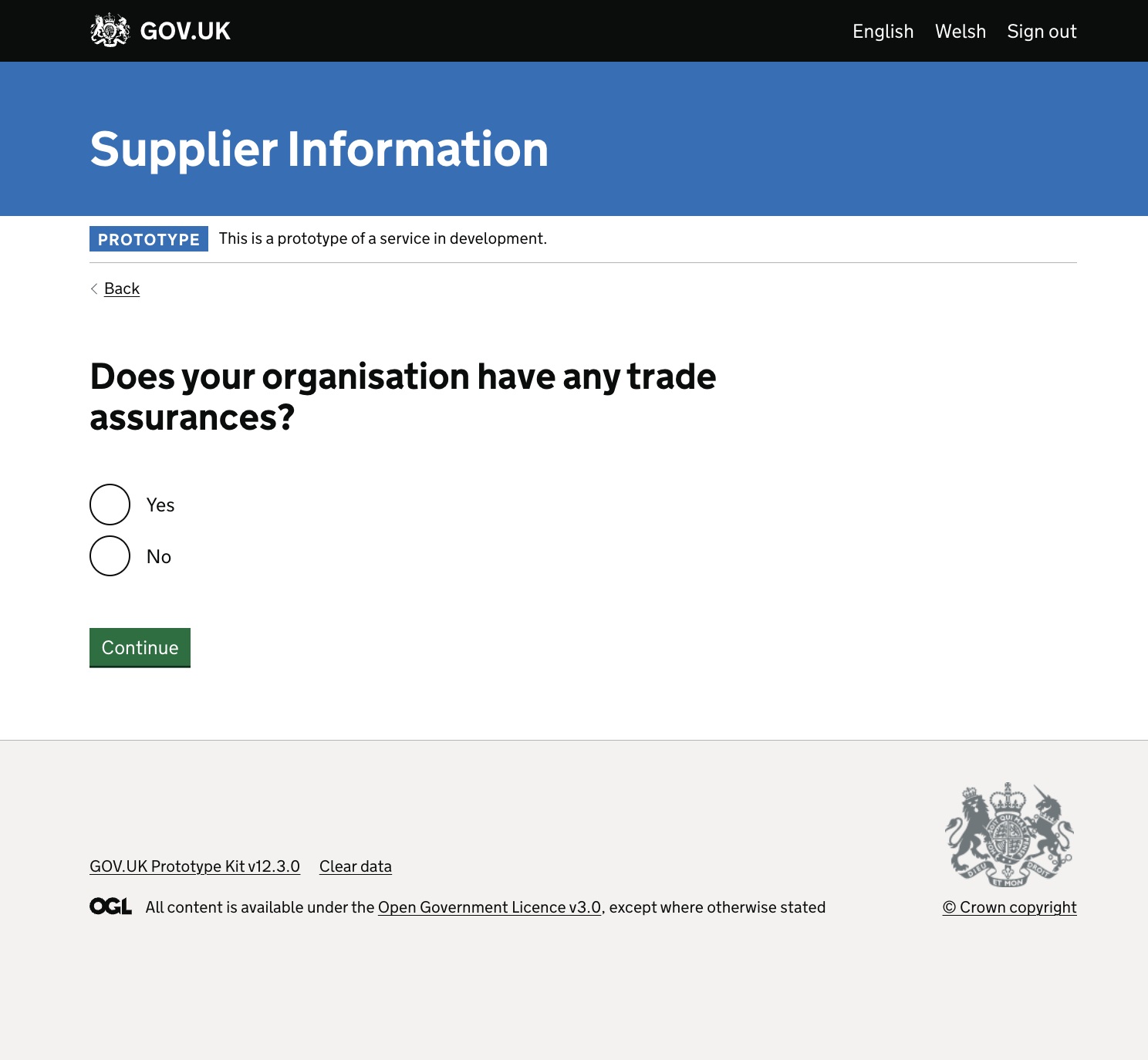
Before the Enhancement

Prior to the change, the screens lacked the additional hint text, which contributed to user confusion.
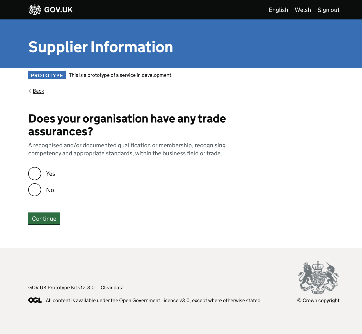
After the Enhancement

Following the enhancement, the screens were enhanced to include more hint text. This additional context provided users with a clearer understanding of what was being asked and why, reducing confusion and enhancing the user experience.
Next steps
The Version 2 of the prototype has added a lot of context with hint text to those certain part of the journey that users faced most clarity issues. In Version 3 we are going to revisit these point and any new pain points that might come up as a result.